Undoubtedly you've heard this before, but I'll repeat it here . . . the
attention span of web surfers is about 15 seconds. If you don't attract
them within those few precious moments, you can probably not count on them
visiting your site again.
Good design does matter!
If your site is just for fun or personal use, you may be tempted to write off good design as an unnecessary complication. Before you do, think about this - almost everything you experience on the Internet comes to you through your eyes. Before your visitors have time to read about your kids, click through to your photo album, or take advantage of your site's nifty new search tool or dynamically generated calendar, they'll take in every detail of your site's colors, design elements, and layout. In many cases, the aesthetic impact of those visuals will determine whether or not your visitors will take the time to check out the rest of your site.
First impressions count. Your web site represents you and is a tool that allows you to communicate with the world. The design of your site will either help or hinder that mission. No matter how much "cool" stuff you have, people will remember having to squint at that dark blue text on a black background to read it.
So before you even begin building your site, spend some time learning and thinking about the visual and aesthetic elements of web design.
Design Before You Build
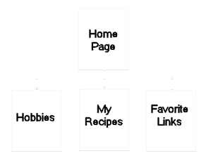
Regardless of its size, scope or purpose, planning is the key to success in building your web site. The first step is to take out some paper and a pencil and write down as detailed a description of your site as possible. List your colors, backgrounds, page elements (text, images, buttons) and the purpose of each. Next sketch a flow chart of sorts, with your home page at the top and additional pages linked together below it as the example below.
Thus, Hobbies, Recipes and Favorite Links would then become your "navigation" system. Now take a sheet of paper for each of your pages and draw boxes where you want images placed and begin placing your text.
Be consistent
If you search the web, you've come across background, after background, after background that you liked. You liked them so much in fact, that you decided to use a different background for each and every page. While this might seem like a good idea, it actually can cause confusion on the part of your visitors as they can think that they are no longer on your site, but on someone else's. Select one background and stick to it, be it a border, color or tiled background.
There is one way you can deviate from this and that is if you have a segment that has topics which can be broken down into a number of different ways such as holidays. If you had a page titled Holidays and then wanted to depict New Years, Independence Day, Halloween and Christmas, each of these sub-themes could have a background of its own, but again use only one background for each of the pages in the sub-theme.
Choose your color scheme
Color is often an area where a site can go wrong right from the start. If you pick a bad color scheme, it will be the first thing your visitors see and they won't ever get over it. Not everyone has 20/20 vision and monitors have different resolutions, so try to pick neutral colors. And keep your text color highly contrasted to your background so that people can view it without having to squint or highlight the text.
And again, be consistent. If you have 3 pages on a particular subject and you use red, white and blue text, use the same colors on all 3 pages. A good rule to follow is to not use more than 3 or 4 colors for your color scheme.
The key elements
Keep your backgrounds simple. Very few things are more
distracting on the web than large images or garish, prominent patterns in
the background. They are also harder to place text on that your
visitors will be able to read without getting a headache.
Use images wisely. Don't add images that add nothing
to the actual content of your page. Also keep them as small as
possible to keep your page's load time down.
Optimize. Try to keep your images as small in size as
possible and reuse them wherever possible. The key here is to try out
all the different options to achieve the smallest possible file size while
maintaining an acceptable level of quality. You can use a program such
as Paint Shop Pro or Photoshop to accomplish this task. Another
imaging program that is currently free is Irfanview.
Consider the total page load time. The principle of
optimization works for entire pages as well. Too many images,
regardless of their size, can still make a page take forever to load.
Keep in mind that not everyone is fortunate enough to be able to afford
cable or a DSL connection.
Text matters too! Font size and color contrast against
your background is extremely important. In addition, consideration
should be given to the formatting of the text on your pages. A larger
font denotes importance; bolding and italics add emphasis. Avoid
underlining text as underlines usually identify them as being a hyperlink.
Avoid center all your text on the page especially if it's in large blocks .
. . doing so makes it difficult to read. Serif fonts versus san serif
fonts should also be given some thought when deciding upon the text for your
site. Serif fonts, such as Times New Roman and Courier, are easier to
read large blocks of text. Sans serif fonts work well as titles.
(Note: The font you select for your page should be a "standard" font,
one which is found on all computers such as Times New Roman, Arial, Verdana.
Your site may look great using a font like "Bloodfest", but if your visitors
don't have it on their computer (and they usually don't), they will see it
in the default font of Times New Roman. If you want to use a special font,
use it for a title line or a header and create it in the form of an image.
In this manner, your visitor will be able to view it as you created it.
This method should not, however, be used for your entire web page because it
will take forever to load and you'll lose your visitors.
Navigation buttons can be a way to combine design and
functionality. They let you spruce up your page and add attractive
(but small) images, while also providing an obvious and user-friendly way to
move around your site. Remember, the purpose of navigation "buttons"
is to help your visitors negotiate your site and they should fit into the
overall design of the web site by complementing the site's color scheme and
being optimized (discussed above). And when adding your navigation
system to your pages, keep the arrangement the same on every page otherwise
it can cause confusion.
Don't overdo the website toys. There are hundreds of other
elements that you can choose to include on your site (search boxes,
pull-down menus, polls, hit counters, etc.). While adding unlimited
interactivity (and clutter) to your site, ask yourself if they add to your
site's topic. Properly used, such extra elements can add greatly to
the value and functionality of your site. Used indiscriminately, they
simple clutter up the space and confuse your visitors.
Creating the layout for your site is the act of taking your
colors, images, text and other elements and finally arranging them on your
page. Try to keep your layout simple and as uncluttered as possible
and, again, the same on all the pages of your site; i.e. three columns or
two columns. Screen resolution is also important. Your page should be
able to be viewed without having to scroll horizontally back and forth in
order to read it. The old standard was 800 x 600 but today, 1024 x 768
is also acceptable. This being the case, try to avoid
placing important material at the very right-hand side of the page as it
might possibly get overlooked.
Use "white" space effectively. When developing your layout, use empty space ("white space") to your advantage. Use it to set important features apart and to group elements according to purpose. Wise use of this space enhances your site's visual appeal, creating a sense of order and simplicity.
Keep it simple
Keep these basic design rules in mind when you design your site and you will be able to create a site that is both attractive and useful. Planning is the key to creating a site that will communicate good looks and a great personality.
Copyright 2002 - 2012
All Rights Reserved - Stormy
Not to be reproduced, published or transmitted electronically in any way without
express written permission.